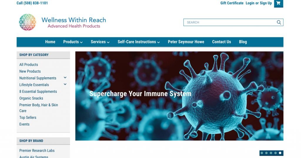
We had a great time roasting the Wellness Within Reach website together! Tria Foster and Jasmine Ellsworth led us on an irreverent review of this B2B health care products site.
We started off in Google and discovered that our site wasn’t on the top half of the first results page. There were some look-alike pages grabbing that top billing! But we did find the right place and set off to dissect (I mean, analyze, of course) this purveyor of medical supplements.
We like to start off by snooping the tech stack with Built With, and what we discovered is that there isn’t really much on the marketing side there.
But the design is very clean and on brand, with a logo that really works and colors that reinforce the brand well. We kind of hated the images carousel on the home page though. They don’t lead to interesting content either, but just take us to the product catalog. Probably not worth the screen real estate.
Now, let’s go shopping! Shopping by category is pretty nice. Making events a product category doesn’t really make sense though. Let’s consider putting that somewhere else. Search by brand is kind of weird though. There are only two brands, so why do we need that differentiation? It’s a bit weird that the category “8 essential supplements” only has 7 products listed. Did a previously listed product fall off the catalog? What went wrong here?
We always like to see how the search works. This one is really nice, and we can click to add products to cart right in the search results. Sweet! Making it easier to buy is always a good thing. But, the “refine search” mechanism is really weird. I search for “digestion” and you ask me if I mean “direction?” Odd.
Looking at an individual product, we see a bunch of empty stars and no reviews. This makes it look like our site is dead in the water. It’s great to have a review mechanism but hide that content unless you have at least one review for the product. That’s taking a lot of screen real estate that could be better utilized. It would be more useful to have the product blurb be in that space. Also, what’s up with all the share to social media logos? Do people do this? This could be a way that people wander away from our product catalog. We have to scroll down to find product detail and the accompanying video. It would be better to see that higher on the screen. But the rollover on the product images is a nice touch.
The mechanism to compare products seems handy, but do people use it? Use metrics to find out what people are and aren’t using on the site. If it’s not utilized, take it off! Free up more screen for the product info and the all-important “buy” button. Oh, whoops, when we compare products we’re seeing the product description but there’s some stray HTML in there.
Okay, now we’re ready to buy some stuff. We put a supplement into the cart and get a message that if we spend $225.05 more, we can get free shipping! Well, free shipping is nice, but yikes! It’s probably better not to offer it or to make the minimum purchase lower. When we go to checkout, we see that there is NO option to do a guest checkout. We understand that’s a requirement of the product vendor, but it’s offputting to have to set up a username and password before you can do the next step. In general, allowing guest checkout is a best practice.
One more thing to check out – the gift certificate link. Oh sweet, this lets you buy, redeem, and check balance all in one place. That’s pretty handy.
We had a lot of fun with this one. It’s a good-looking site but there’s always room for improvement! Join us next time as we drop some messy reality all over another B2B website!


