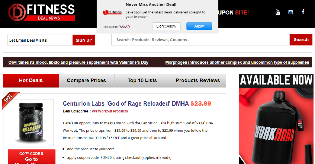
This doesn’t look like the kind of website that we usually roast. It’s an affiliate site which pulls in viewers and directs them to other sites to make purchases. These sites can be really strong money- makers, and they have to be very good at SEO and ad buying.
This site definitely doesn’t have a ‘designer’ feel, but if you look at the products they’re selling, they aren’t designer products. The color scheme of red and black is aggressive and creates a little anxiety. It’s not cozy, but it suits the target audience and the purpose well. Just because something isn’t pretty doesn’t make it bad. It might sell better than something that is highly refined. The color palette is simple and bold and stays true to the look. They don’t confuse the customer with any extraneous content or navigation.

There’s just enough information to get you to engage or leave. Website design should be about function. And this site does its job. It’s all about the deals, and if the deal works for you, great!
There’s some good tech under the hood of this site. The owner clearly cares about user experience and knows the tools that are available. We see MouseFlow for user behavior tracking. They are using CloudFlare and lots of ad tech. The platform is on WooCommerce which sits on top of WordPress.

We like to explore product category pages, so we’ll take a look at Protein Supplements, which is a commonly used product for people who work out. On the category page they have a lot of good elements, with images, price points, and find the best deal. We’re getting some squishing on the images, but that may be the fault of the product companies. When we go to the product page, we get sufficient detail and a nice big red button that sends us to the store. When you click out to the store, there’s a tracking link so that the affiliate gets the appropriate commission.
We like to check out the search on any site we roast. Search is more than just a way to help your user find what they are looking for. It also gives you data about what the customer wants. This is a really nice search experience. The search results are divided into categories, such as product reviews, product categories, product brands, etc. We may want to use this idea on other sites we work on, because it’s powerfully good. Now we’re on a page displaying search results, and it looks a lot like the category page, but it lacks some of the information that the category page gives us which allows us to differentiate products. It would be great if the search results gave me that information so I can identify FROM HERE if that’s the product I’m interested in. It would also be good to have a filter on the search results, like maybe a price filter. If I have 651 pages of search results to wade through, I’m going to need a way to trim that list down. Also, DON’T show us expired deals on search. It’s not useful. Omit them instead of showing them greyed out.
We’re checking out product reviews. It would be interesting to see if visitors could enter supplements that they currently use and then offer a comparison with recommended alternative products for them.
There’s an art to creating video thumbnails that get the click. Big text, shock value, concealing the face – looks like this guy is using A/B testing to determine what’s the most effective way to get people to engage. We’re going to go to the associated YouTube channel. The video channel is really consistent with the branding of the website, both with the look and the no-nonsense messaging.

You don’t NEED a professional videographer to develop video content. If you’re passionate about your products and you have a smartphone, you can create great video content. If your audience is younger, you definitely NEED video content, because that’s how Millenials and especially GenZ learns and makes buying decisions.
If you want to watch the recording, check it out here.


