

Overview
This article will introduce you to some general strategies for writing flexible markup as well as provide some specific examples that you can take away for your next project. First let’s look at just a few of the modern trends in web design:
- minimize class usage
- minimize tag usage
- semantic markup
- reusable markup
Look familiar? The first three trends are certainly accepted and practiced on a regular basis. Reusable markup, however, is often paid lip service but rarely practiced. What I’m going to show you is how to take the first three trends and set them aside so that we can achieve the fourth.
Reusable markup is not appropriate for every project. Semantic markup, minimal tags, and minimal classes are generally a good thing. However, there are times when flexibility and markup reuse are more important.
Let’s look at a few examples where this is the case. When designing for a content management system (CMS), it is especially important to ensure that your markup is both flexible and robust. Many content management systems use a template based architecture for building pages, and therefore your markup must be capable of supporting diverse designs without significant modification.
Or you may be working in an environment where the HTML cannot be modified, but you have full control of the CSS. In such a situation, it is extremely important that your HTML can accommodate changes. While it’s true that no two projects will use the exact same markup, a little forethought can go a long way when reusing code.
General Strategy
Element ID’s and Clases
Element ID’s differ from classes in a number of ways. First of all, ID’s must be unique in an HTML document. Duplicate ID’s might appear to work at first glance, but your markup won’t validate and you will likely run into problems when working with Javascript and CSS. When you consider some unique components might later be repeated on a page, it’s important to choose your ID’s carefully.
Another consideration is that ID’s carry more weight (10 to 1 ratio) when measuring CSS specificity. Take the following markup and CSS for example:
<div class="box">
    <p id="para" class="review">
    ...
    </p>
</div<
#para {
    width: 400px;
}
    div.box p.review {
    width: 200px;
}
The first rule (#para) will be honored even though the second rule (div.box p.review) is declared subsequently and contains more selectors. This is because the ID selector counts as 10 points (an ID), while the second rule counts only as a total of 4 points (2 elements and 2 classes). Of course, you could override the ID selector by using the , but such a technique should be used sparingly.
ID’s have their place in markup – they’re easier to target with Javascript and sometimes their greater specificity makes sense in CSS. Nevertheless, try to limit ID’s to the main page components such as the header, body, aside, and footer. Otherwise, consider using a class just to be safe.
Styling Element Selectors
When designers first began taking advantage of CSS, they used classes almost indiscriminately which resulted in markup only marginally preferable to inline style. As techniques progressed, most designers have switched to using as few classes and ID’s as possible while targeting child elements using descendent selectors. This is generally the preferred method, but something to be careful of when designing for user generated content. Let’s look at the following example which includes a div with a child blockquote:
<div id="my-body">
  <blockquote>
    Lorem ipsum dolor sit amet, consectetuer adipiscing elit. Proin in tellus quis eros imperdiet tempor. Morbi et sem lacinia nisi molestie auctor. Mauris rhoncus augue eu eros. Cras porta dui nec odio.
  <blockquote>
</div>
It might be tempting to target this using the following:
#body blockquote {
  background: #EFEFEF;
  border: 1px solid #CCC;
}
While this works fine and keeps your blockquote element free of a class, this method runs the risk that any user generated content will also receive the same styling which may not be your intent. Even though it’s somewhat antithetical to recent markup trends, you might want to be more explicit:
<div id="body">
  <blockquote class="review">
    Lorem ipsum dolor sit amet, consectetuer adipiscing elit. Proin in tellus quis eros imperdiet tempor. Morbi et sem lacinia nisi molestie auctor. Mauris rhoncus augue eu eros. Cras porta dui nec odio.
  <blockquote>
</div>
#body blockquote.review {
  background: #EFEFEF;
  border: 1px solid #CCC;
}
This ensures that any user generated blockquote will receive generic style, but your review blockquote will receive your intended style.
Anticipating User Generated Content
Many sites today deal with user generated content in one way or another. CMS’s typically offer rich text editors that offer users the opportunity to add just about any type of content to a page. Whether it’s a content management system, a social network, or an e-commerce site, it’s a good idea to anticipate the nature of the user generated content that your design must accommodate.
First, a good practice to employ is a CSS “reset” file. Since different browsers have different default values for HTML elements, it’s a good idea to normalize all elements before you apply any specific style. A reset will style all common HTML elements with consistent values. For example, one browser might apply a 1em margin for headings, while another browser might apply 2ems. Using a reset file in this case might set the margin to 0ems for all browsers, giving you a common starting point for your custom style. Without a reset file, you might run into some unexpected inconsistencies between browsers.
Next it’s a good idea to set up a base CSS. Your base should create a consistent, simple style that you can use as a starting point for your design. Additionally, this base style can be used for any user generated content which will likely be some type of general rich text. This is why it’s important to be careful when styling your element selectors so that you don’t unintentionally affect any user generated content.
One final technique you can employ when dealing with such content is to take care of max-widths, word-wraps, and overflows.
Setting a max width in the content area of your site helps to prevent the horizontal dimensions from being pushed beyond their intended boundary. This can happen with large images, unbroken character strings, and user generated inline style. For most modern browsers, you can simply set the max-width in CSS. For example, if your content area is 600 pixels wide div with an id of “article”, you could do the following:
<div id="article">
  ...
</div>
And in your CSS declare:
#article {
  max-width: 600px;
}
Keep in mind however that this does not work in IE6, so if you are supporting that browser version you’ll need to set max-width using external Javascript or with the following Javascript in CSS:
#article {
  width: 600px;
  _width: expression(document.body.clientWidth > 601? "600px" : "auto");
}
One nice CSS property found in IE6, IE7, and Safari 3.1 is word-wrap, which was introduced by Microsoft and is now part of the CSS3 working draft. The word-wrap property accepts the value of break-word, which tells the browser to break any text string that reaches the horizontal boundary of its container, and wrap the string to the next line. Taking our “article” div as an example again, we can declare:
#article {
  word-wrap: break-word;
}
Unfortunately this doesn’t currently work in Firefox or Opera, but is expected to be supported in Firefox 3.1 and an undetermined future version of Opera. There are some workarounds for Firefox, but they are not trivial to implement and the result is less than ideal. As a defensive measure for the browsers, you can set the overflow-x property to either hidden or scroll depending on the your desired effect. This will at least ensure that your dimensions are respected and any content that is too wide for the div will trigger the overflow according to your design needs.
Examples
The following examples will work in all modern browsers1. For convenience I have embedded screen captures in this article, however you can download the working examples in a separate file.
Buttons
One of the most common web site elements is the button. Let’s take a look at a plain button element:
<button>Click Me</button>
Figure 1:
A plain button with no styling.
Often a plain button will do just fine, but you might want to match the visual design of the site. Or maybe you just want the button to look consistent across different browsers and operating systems. Let’s take a look at the same standard button with some additional styling:
<button>Click Me</button>
button {
  background: #EBF4F8;
  border: 1px solid #B6CCD2;
  color: #0671AB;
  padding: .7em;
}
Figure 2:
A button with CSS style.
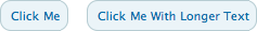
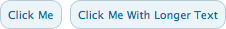
That’s better! It has a bit more style and appears consistently across browsers and OS’s. But what happens if you don’t know what the final design is going to look like, and another developer is waiting on the markup? You could give that developer what you have now, and go through the whole process again if there are any design changes. Or, you could add add a little more markup and allow yourself some design flexibility.
Let’s say the client decides they prefer something a bit softer with rounded corners. That’s simple enough you think, you can just create a background image and add that to your CSS rule. But that doesn’t allow for variable width content – for that we’ll need something extra. The extra markup, or “hook”, provides an additional element to which we can attach another background image. We’ll employ the “sliding doors” technique and attach one image to our button element and one image to our span element. This will ensure that our button will scale horizontally.
<button><span>Welcome to our Intranet</span></button>
button {
  background: url('button-right.png') right center no-repeat;
  border: none;
  color: #0671AB;
  height: 30px;
  margin-right: 7px;
  padding: 0 7px 0 0;
}
button span {
  background: #EBF4F8 url('button-left.png') left center no-repeat;
  display: block;
  line-height: 15px;
  margin: -2px 0 0 0;
  padding: 7px 0 7px 10px;
}
Figure 3:
A buton with markup hooks and background images that scales horizontally.
And now we have a button with rounded corners that scales to any horizontal dimension. By planning ahead and adding your hooks, you can be more certain that future design changes won’t require any markup modifications.
Lists
Another common website element is the list. First let’s take a look at a standard, semantically marked up unordered list of items:
<ul>
  <li>Item One</li>
  <li>Item Two</li>
  <li>Item Three</li>
  <li>Item Four</li>
</ul>

Figure 4:
A plain unordered list with no styling.
Nice and clean. Now let’s add a bit of style. We’ll take the same markup and give the whole list a blue background and separate each item with a horizontal line using the following CSS:
ul {
  background: #EBF4F8;
  border: 1px solid #B6CCD2;
  color: #0671AB;
  padding: .5em 1em;
  width: 300px;
}
ul li {
  border-bottom: 1px solid #B6CCD2;
  background-image: url('bullet.png');
  background-position: center left;
  background-repeat: no-repeat;
  list-style: none;
  padding: .5em 0 .5em .5em;
}
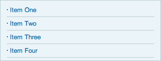
Figure 5:
An unordered list with with CSS style.
That’s looking better. But the separator on the last item looks a bit out of place with nothing below it. There are a number of ways we could fix this. We could use Javascript to navigate the DOM and remove the border from the last list item, but that seems a bit heavy-handed. We could add a class called “no-border” to the last item, but that’s not a very semantic name and we may want to do something different in the future that doesn’t make sense when called “no-border”.
Let’s examine the common design problem here. Very often a designer will want to style the first or last item in a list differently – for example, adding or removing a border, changing the background image, etc. Sometimes these changes come late in a projects life cycle, and it may not be so easy to change the markup. To anticipate this, we can add a class called “first” to the first item in the list, and a class called “last” to the last item in the list. Let’s look at the new markup and CSS to achieve this:
<ul>
  <li class="first">Item One</li>
  <li>Item Two</li>
  <li>Item Three</li>
  <li class="last">Item Four</li>
</ul>
ul li {
  border-bottom: 1px solid #B6CCD2;
  background-image: url('bullet.png');
  background-position: center left;
  background-repeat: no-repeat;
  list-style: none;
  padding: .5em 0 .5em .5em;
}
ul li.last {
  border-bottom: none;
}

Figure 6:
An unordered list with classes on the first and last items.
Now, we’ve removed the last border. That looks better! While we’ve only used the last class in this case, it’s a good idea to include both just in case. This first/last method can be used for any type of repeating element on a page and be very convenient when you need to fine tune the design.
We can also apply the technique we learned about buttons to provide additional hooks that we might want for each item. In this case we want two images on each list item – one for the bullet and one for an arrow on the right. Here is our final markup and visual design:
<ul>
  <li class="first"><span>Item One</span></li>
  <li><span>Item Two</span></li>
  <li><span>Item Three</span></li>
  <li class="last"><span>Item Four</span></li>
</ul>
ul li {
  border-bottom: 1px solid #B6CCD2;
  background-image: url('bullet.png');
  background-position: center left;
  background-repeat: no-repeat;
  list-style: none;
  padding: .5em 0 .5em .5em;
}
ul li.last {
  border-bottom: none;
}
ul li span {
  display: block;
  background: url('list-arrow.png') center right no-repeat;
}
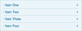
Figure 7:
An unordered list with markup hooks for background images.
Boxes
Boxes are everywhere in web design. They’re used to organize content on the page and highlight information. All modern browsers can handle some level of style without resorting to markup hooks. Let’s look at an example box with some text and simple styling:
<div>
  <p>
Lorem ipsum dolor sit amet, consectetuer adipiscing elit. Proin in tellus quis eros imperdiet tempor. Morbi et sem lacinia nisi molestie auctor. Mauris rhoncus augue eu eros. Cras porta dui nec odio. Donec interdum, tellus id volutpat faucibus, mi lacus tempor tortor, eget pellentesque mauris nunc ut ante. Vivamus nec sapien ac lorem volutpat consequat. Quisque dolor. Vestibulum ante ipsum primis in faucibus orci luctus et ultrices posuere cubilia Curae; Nullam lacinia erat. Maecenas vestibulum.
  </p>
</div>
div {
  background: #EBF4F8;
  border: 3px solid #B6CCD2;
  color: #333;
  padding: 1em;
  width: 400px;
}
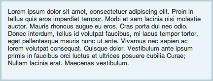
Figure 8:
A box with CSS style.
That looks nice and clean. But once again let’s look at the challenge presented by rounded corners, as it’s such a common design technique. Just like our button above, we could use a single background image and fix the height and width of the div to match. Unfortunately that doesn’t work with dynamic content and therefore is not very flexible. We could create two images – one for the top half and one for the bottom half, but that doesn’t scale horizontally. Let’s be sure our box can handle anything and allow it to scale both horizontally and vertically.
Because a single HTML element can only have one background image attached, we’ll need five elements to achieve our box – one element for the container and one element for each corner. We’ll nest them like this:
<div>
  <div class="upper-left">
    <div class="upper-right">
      <div class="lower-left">
        <div class="lower-right">
          <p>
Lorem ipsum dolor sit amet, consectetuer adipiscing elit. Proin in tellus quis eros imperdiet tempor. Morbi et sem lacinia nisi molestie auctor. Mauris rhoncus augue eu eros. Cras porta dui nec odio. Donec interdum, tellus id volutpat faucibus, mi lacus tempor tortor, eget pellentesque mauris nunc ut ante. Vivamus nec sapien ac lorem volutpat consequat. Quisque dolor. Vestibulum ante ipsum primis in faucibus orci luctus et ultrices posuere cubilia Curae; Nullam lacinia erat. Maecenas vestibulum.
          </p>
        </div>
      </div>
    </div>
  </div>
</div>
Now we’ll add some CSS to make it all work. Each corner element will have its own background image while the container has a border to make it all appear seamless.
div {
  background-color: #EBF4F8;
  border: 3px solid #B6CCD2;
  width: 426px;
}
div .upper-left {
  background: url('box-upper-left.png') left top no-repeat;
  margin: -3px 0 0 -3px;
}
div .upper-right {
  background: url('box-upper-right.png') right top no-repeat;
  margin: 0 -3px 0 0;
}
div .lower-left {
  background: url('box-lower-left.png') left bottom no-repeat;
  margin: 0 0 -3px 0;
}
div .lower-right {
  background: url('box-lower-right.png') right bottom no-repeat;
  margin: 0 0 -3px 0;
  padding: 1em;
}

Figure 9:
A box with markup hooks for background images to create rounded corners and scalable dimensions.
And there is our fully scalable box with rounded corners. It works, but that’s a lot of effort just to get rounded corners. And it gets trickier if your box will appear on different backgrounds or if you need a gradient inside the box. There’s got to be an easier way, right?
Looking Forward
Many of the strategies discussed in this article should be useful for years to come. Anticipating user generated content, selecting ID’s and classes appropriately, and generally thinking through your entire design are approaches that are not going to disappear. However, recent advances in CSS suggest that many of the markup hooks described above will not be necessary in the coming years. In fact, the current CSS3 working draft obviates the need for all them. Safari 3.1, Firefox 3, and Opera 9.5 all have some level of support for CSS3 and promise more to come. Even Microsoft has begun introducing some CSS3 support in their IE8 beta.
Let’s take another look at the examples above and see what we can do with a browser that supports some of the CSS3 recommendations.
Buttons
The new border-radius property allows rounded corners without the need for images or markup hooks. You can use this today with experimental support in Safari 3.1 and Firefox 3.
<button>Click Me</button>
button {
  border: 1px solid #B6CCD2;
  background-color: #EBF4F8;
  color: #0671AB;
  padding: .7em;
  -moz-border-radius: 10px;
  -webkit-border-radius: 10px;
}
Figure 10:
A button with CSS3 border-radius applied.
Lists
If you’ll recall in our example above, we had to use markup hooks and extra classes to achieve or design goal. Now let’s see what we can do with a plain semantic list.
<ul>
  <li>Item One</li>
  <li>Item Two</li>
  <li>Item Three</li>
  <li>Item Four</li>
</ul>
ul {
  background: #EBF4F8;
  border: 1px solid #B6CCD2;
  color: #0671AB;
  padding: .5em 1em;
  width: 300px;
}
ul li {
  border-bottom: 1px solid #B6CCD2;
  background-image: url('bullet.png'), url('list-arrow.png');
  background-position: left center, right center;
  background-repeat: no-repeat;
  list-style: none;
  padding: .5em 0 .5em .5em;
}
ul li:last-child {
  border: none;
}

Figure 11:
An unordered list with CSS last-child style.
Looks great, and no extra spans or classes were needed! Using the last-child pseudo element supported by most modern browsers (CSS2), and the multiple background image support of Safari 3.1 (CSS3) we can achieve the same effect.
Boxes
Now we’ll take a look at our last example, the scalable box with rounded corners. Remember all the hooks and images we needed before? Here’s the only markup we need if we’re using CSS3:
<div>
  <p>Phasellus adipiscing iaculis nisl. Phasellus ultricies odio a lacus. Proin sollicitudin adipiscing velit. Donec tempor tortor at elit scelerisque tincidunt. Suspendisse potenti. Donec egestas est ut elit.
  </p>
</div>
    div {
      background: #EBF4F8;
      border: 3px solid #B6CCD2;
      color: #333;
      padding: 1em;
      width: 400px;
      -moz-border-radius: 10px;
      -webkit-border-radius: 10px;
    }
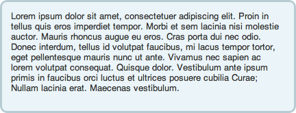
Figure 12:
A box with CSS3 border-radius style.
Once again we use the experimental border-radius property and our rounded, scalable box is now simple to create.
As you can see, it’s already possible to eliminate all of the aforementioned hooks with a shipping browser (Safari 3.1). There are other CSS features coming soon that I didn’t even touch on in this article such as animations, transformations, variables, and more. It will take some time, but all the major browsers will eventually get there and the users will be sure to follow. Until then, a little extra markup will help you on your way.
Conclusion
While the benefits of semantic and minimal markup are great, writing reusable code can be more important in some situations. If you’re creating page templates for a CMS or working in an environment where the markup is not always available for modification, you may want to consider adding some extra hooks. The defensive CSS strategies are always good to keep in mind when dealing with user generated content. Whether or not these techniques are appropriate for your next project, is something that you’ll have to decide.

